Movement in Sketch

In class two of ICM, we were asked to add movement to our sketches to an interactive component. The sketch was to include all the following elements:

  • One element controlled by the mouse.
  • One element that changes over time, independently of the mouse.
  • One element that is different every time you run the sketch.

Here is my sketch called Horus. Feel free to interact and click on the canvas

Here is the code associated with the sketch:
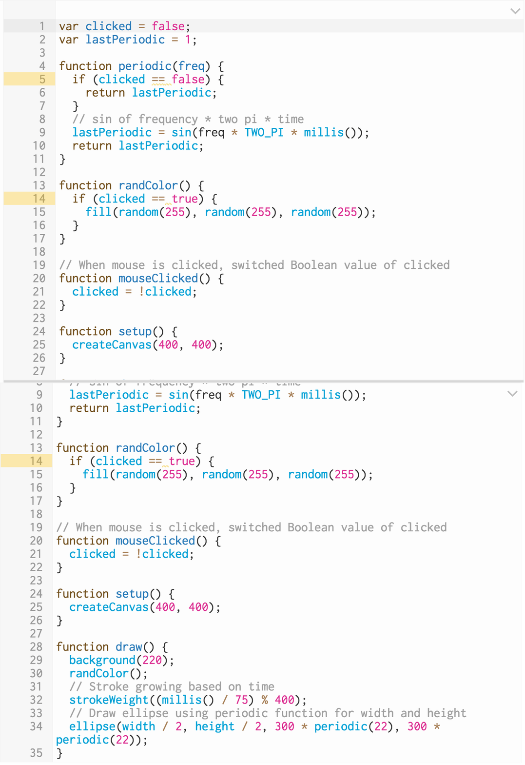
psych-horus-code

I was interested in trying to apply a sinusoidal waveform equation to an interactive image to see what could be created with this.  My partner has a signal processing background so he helped me through the logic of those calculations. The sine wave equation was taken from is location and iterated on to achieve the desired effect.

I wanted to create something that initially had a smooth and calming state that could be disrupted by a mouseClicked to transform to an opposing state. The hectic-ness of the quick sinusoidal wave can then be jolted back to a smooth and appealing visual with a second mouseClicked.

There is a time-based element included in this sketch where the strokeWeight continually grows over time to the height and width of the canvas an then resets to the the size of the ellipse created.

The element that is constantly random is the color associated with the ellipse that is constantly generated.

Working through the logic of movement with the application of math is an intriguing concept that I am eager to continue to explore.


Signage

Why is successful signage important? Julia Turner describes in her article, The Secret Language of Signs, the three reasons for the need and attention on design in this area:

  1. Developing countries are constructing increasingly more complicated spaces. Infrastructures and new designs for community spaces are here to stay.
  2. With an increase of globalization across the planet, signage needs to be interpreted by many individuals no matter what language they speak or what cultural background they come from.
  3. Increasing inclusiveness for individuals that are differently abled.

For our second class we were asked to explore the streets of New York and document some unsuccessful signage. When signage is done well, it helps to direct you to where you need to go, it provides intuitive instruction, and sufficient identification.

Here are my three signs that, in my opinion, fell short in what defines successful:

  1. Bleeker Street Subway Station

Switch + LED Circuit

Project Expectations

For our second class assignment, we were asked to create a simple application of switch and LED circuit.

Below is my pushup switch:

Motivation

After moving to Manhattan, I've been feeling the roughness that the city can exhibit.  With this in mind, I feel like it's important to take my personal safety into my own hands.  Strength building is something that I haven't been great with in the past, but it's never too late... right?

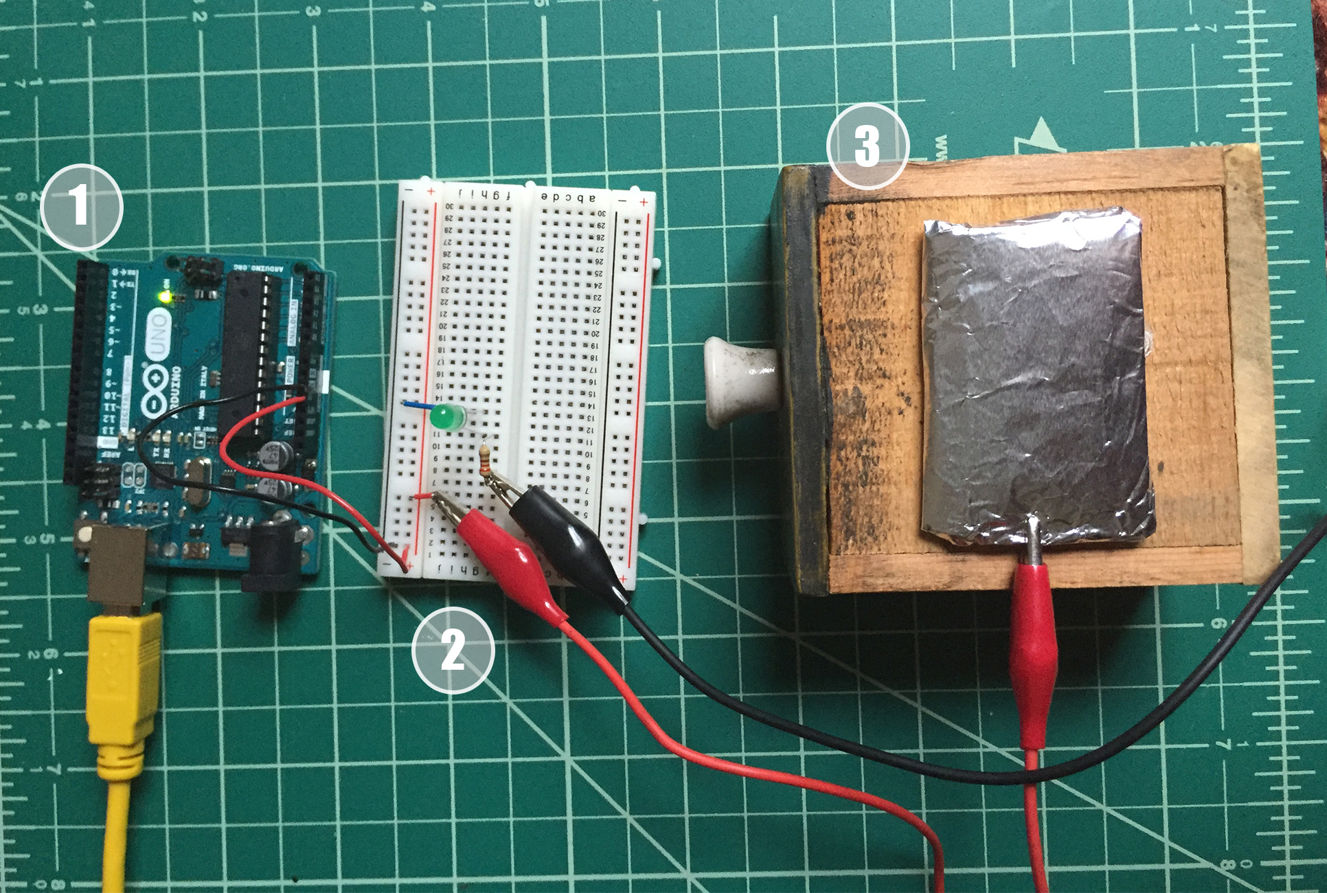
I decided to create a circuit that is only closed when an proper full pushup is completed.  When my nose, wrapped in conductive copper tape, touches the aluminum-covered pad, the green LED lights up to indicate a complete circuit and perfect pushup.

Components


Nose attachement:
  • copper tape
  • black jumper wires
  • alligator clip jump wire

file-sep-19-6-30-40-pm

Circuit:
  1. Arduino Uno
  2. Breadboard with 220 Ohm resistor, green LED, and alligator clip jump wires
  3. wooden platform with aluminum-wrapped landing pad and alligator clip jump wire


setup


Computation + First Attempt at p5.js

My parter received his masters degree from CCRMA (Center for Computer Research, Music and Acoustics) at Stanford University. When we learned that he got into the program, stuffed our car and moved from Toronto, Canada to California. The research and contributions that came out of this program spans such areas as engineering, physics, computer science, psychology, and music (including performance, analysis, and composition).  Some of the projects that I got the experience were beautiful melodic compositions and others were a glitchy, generative sound that can really challenge your perspective on what constitutes music.

The students would often hold live performances late in the semester to show case their projects to the department and community.  At these small, intimate shows of not more than 60 people sprawled out in the CCRMA back lawn, I experienced the live generative visuals created by Reza Ali.  At that time I didn't truly understand what he was creating. I initially thought he was playing a video that he pre recorded before the show. Not so. He was making generative art visuals on the spot to accompany the glitchy soundscape of CCRMA's progressive computer generated music.

Something about what he was creating on the spot inspired me and I would love to get to the opportunity to get to create some visuals and possibly live generated art for a performance in the future.


My first attempt at p5.js

We all have to start somewhere right? I found this image online, which I love, so I wanted to try to recreate it

My very first p5.js sketch isn't as beautiful as Reza's creations, but I had a great time making it.

I choose to try and make an animal that I think are truly beautiful and I called it fire fox:

screen-shot-2016-09-15-at-10-45-22-am

The sketch of fire fix can be found here.

The challenge that I faced when creating this image, and not something I expected to be so hard, was the mirroring of the shapes on the canvas to get the legs, eyes and ears (the ears still don't look mirrored after much manipulation) centered on the imaginary y-axis that would be drawn down the middle of the sketch. (I will be asking the teacher for a possible solution and will get back to you on the most efficient way to do this task.)

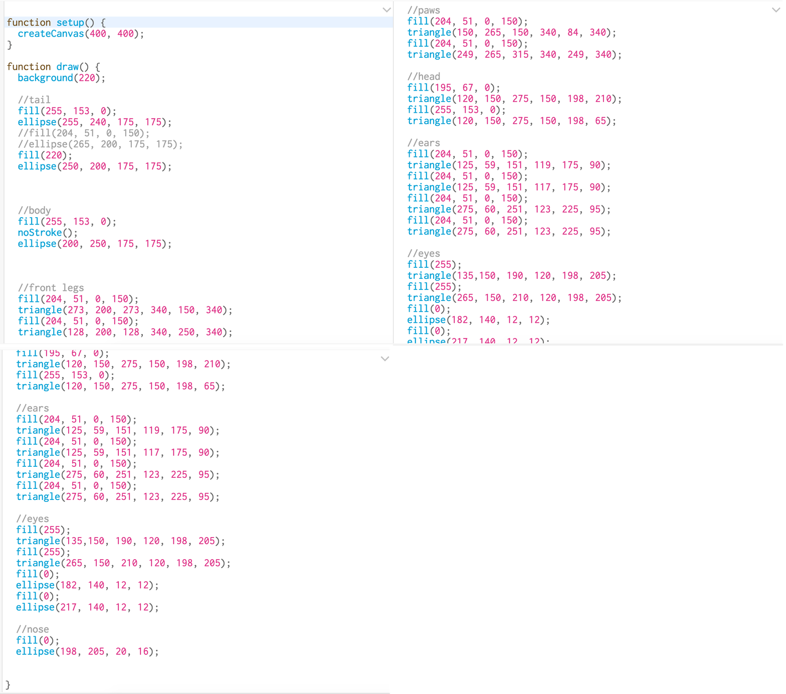
Below is my code and the first layered shapes of the fox:

assignment1_code screen-shot-2016-09-12-at-6-43-52-pm


Design is a communicative device

For class 1, we began analyzing the concept of visual language in images. We were asked to find an image that resonated with us.  I chose this MoMA Forum on Contemporary Photography poster image:

moma_highres
moma_highres
  1.      Analyzing the system using a grid
visual-language_assignment1

Even amongst the chaotic picture of randomly folded paper, the grid lines nicely outline that, indeed, there is some intended text placement on this poster. All of the important text is clearly boxed within the lines of the grid.

2.   Make one thing important

I believe that since the MoMA Forum title is at the top of the pile, this helps to highlight this is the most important aspect of the image.  It's very interesting how they used layering and texture to emphasize hierarchy in this image.

3.  Topography

It appears that only one type of font was used in this poster.  They played with All-Caps to draw the eye to the important titles on the page.

4.  Color
colors
colors

Only three colors were used in this piece and I think they work perfectly for this image:

I really like the simplicity of the dark grey and white and then how they added a splash of orangey-red to tie the piece together.  The color really make the entire poster pop!